Free Shipping. Check it now.

Design

The design story

Our journey towards the desired Mudita Pure look and feel.

Building the foundations

Our main goal

We knew from the beginning that designing Mudita Pure would be an exceptional challenge. It was about defining the look of a phone created not only to serve as a reliable device but also, to make a statement. A device that encourages its owner to be less dependent on technology and more immersed in the present moment.

Our goal was to give the world mobile phones that help people make space for the things that matter to them the most. It was clear to us that the design had to reflect this message.
Mudita Pure is a modern take on a classic phone.

Mudita Pure is a modern take on a classic phone.

Defining the core principles

We appreciate the wisdom of Buddhism. We’re doing our best to follow it when creating our company and products. We’re called Mudita for a reason. This word comes from Pali, an ancient Indian language, and can be explained as an unselfish joy of happiness of others. We also feel that the values of modern, Eastern aesthetic are the closest to our hearts. Following this inspiration we defined the core assumptions for Mudita Pure and all our products design:

  • As neutral and simple as possible

  • Not attention grabbing

  • Not interfering with life, with daily tasks and behaviors

Inspired by a stone

In a very natural way, our main inspiration for the shape of Mudita Pure became a stone. We loved its roundness, structure and what it represents: a balance between man-made structures and nature.

Neutral in appearance, hence neutral in people’s life.

We appreciate pure beauty of real simplicity and minimalism.

We appreciate pure beauty of real simplicity and minimalism.

Defining direction

We started the design process by analyzing our main inspiration. We gathered quite a decent collection of stones in our office! Our Head of Design, Gosia, began studying the different shapes and properties of all of these natural treasures. They were picked by us and our friends on different occasions, in many locations around the world. Everyone wanted to contribute a stone to the creative process!

Pure was designed to be both simple and neutral. We took our inspiration from the shape of a stone.

Pure was designed to be both simple and neutral. We took our inspiration from the shape of a stone.

Consulting design professionals

Before we decided to work with an in-house industrial designer, we consulted our project with several design studios in Europe. We received some brilliant and beautiful ideas, but unfortunately, some of them simply weren’t manufacturable. We somehow still couldn’t find the right one. Since the moment we met Gosia, our fantastic designer, we knew she could help us do it. She analyzed our desired effect, the proposals, our feedback and our perfect shape started to emerge.

Gosia, the Head of Design at Mudita.

Gosia, the Head of Design at Mudita.

Surrounding ourselves with inspiration

The next step was to gather more inspirational ideas, brands, products, studio photos and any objects that felt close to the result we wanted to achieve. We went from Japanese brands, whose approach and aesthetics inspire us, such as MUJI, through design studios, like Nendo or Leibal, through more European approach of Scandinavian brands and studios, such as HAY or Permafrost, to even Volvo or BMW cars to study the materials and finish.

We admire Japanese and Scandinavian design traditions combining ZEN aesthetics with nature itself.

We admire Japanese and Scandinavian design traditions combining ZEN aesthetics with nature itself.

Thinking about the users

We could not start the work before really considering the most important people - the users of Mudita Pure. Who are they? What do they like? What are their opinions, beliefs and needs? Mudita Pure is not a device for everyone. We were talking to a lot of people, those who were really excited about our project, but also to some who were rather sceptical. Those conversations brought a lot of precious ideas, knowledge and also criticism, which enabled us to look at Mudita Pure from a different angle.

We removed all of the unnecessary distractions and kept the essential functionalities with a few unique features.

We removed all of the unnecessary distractions and kept the essential functionalities with a few unique features.

All that gave us a picture of a moodboard

A moodboard for what the Mudita products should look like and what they represent. We wanted to define the features of the design that would make it meet our core assumptions. This moodboard became our reference and a compass that we could come back to whenever we felt that we had strayed too far.

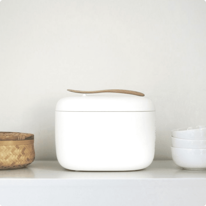
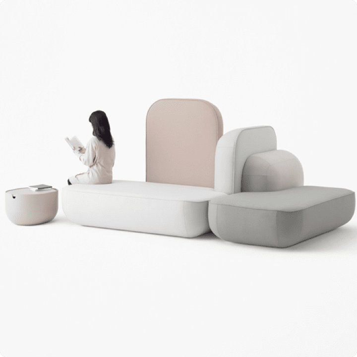
Invisibility

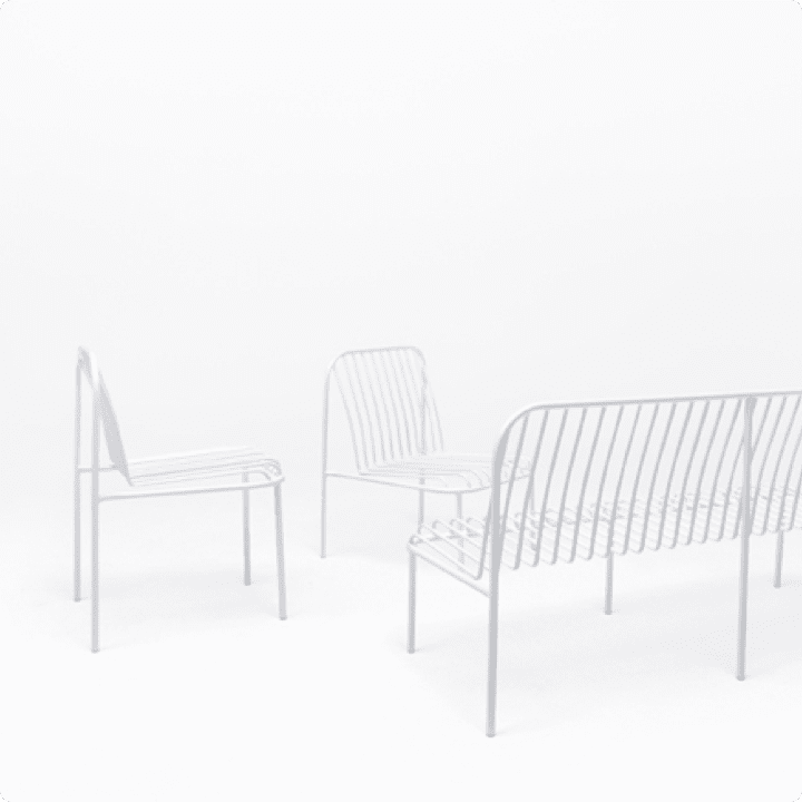
This feature says that our products shouldn’t scream for attention, they should be almost invisible and blend into their surroundings.

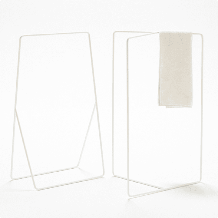
  • www.nendo.jp

    www.nendo.jp

  • www.topys.cn

    www.topys.cn

  • www.nendo.jp

    www.nendo.jp

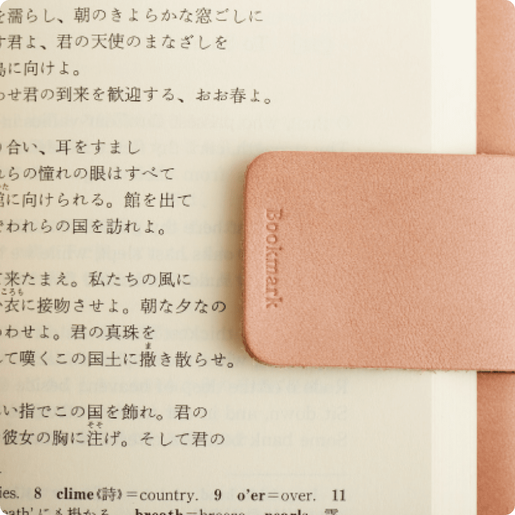
Minimalism & Simplicity

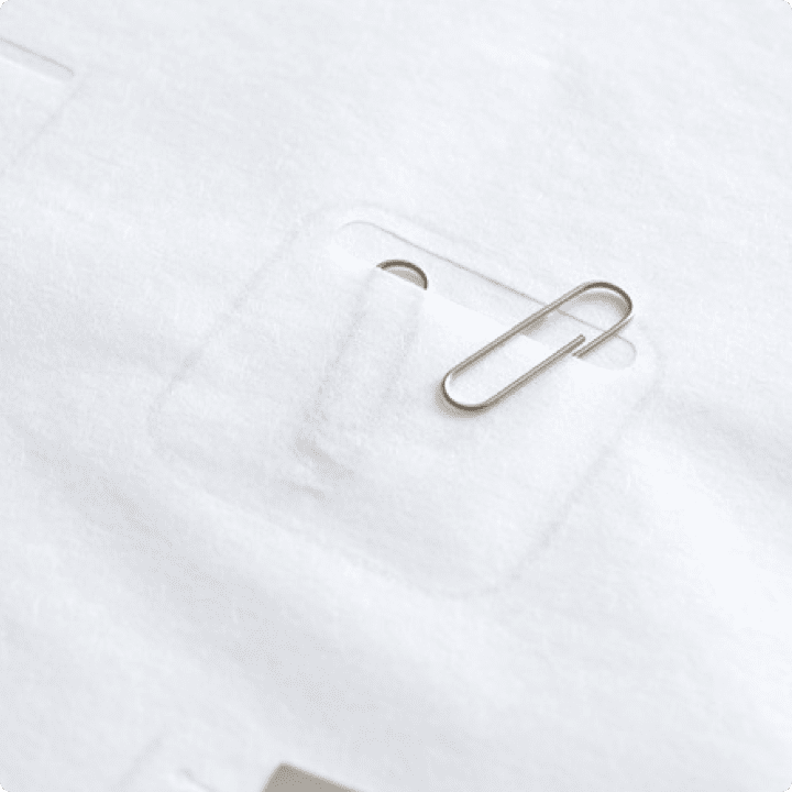
We decided not to add anything to our products that would be useless. No decoration. No needless elements. Form follows function - that’s all.

  • www.nendo.jp

    www.nendo.jp

  • www.bang-olufsen.com

    www.bang-olufsen.com

  • www.ideasgn.com

    www.ideasgn.com

  • www.irose.jp

    www.irose.jp

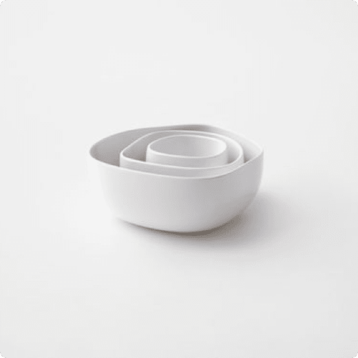
Softness and roundness

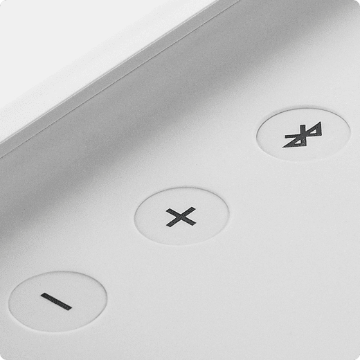
We wanted our products to be friendly in both appearance and touch. No aggressive shapes or sharp edges.

  • www.muji.com

    www.muji.com

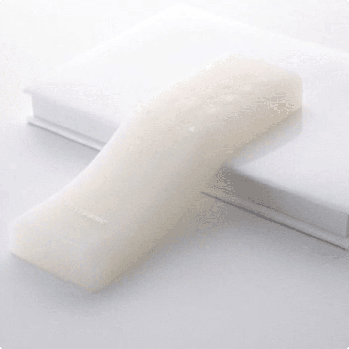
  • Panasonic Gel Remote Control

    Panasonic Gel Remote Control

  • www.nendo.jp

    www.nendo.jp

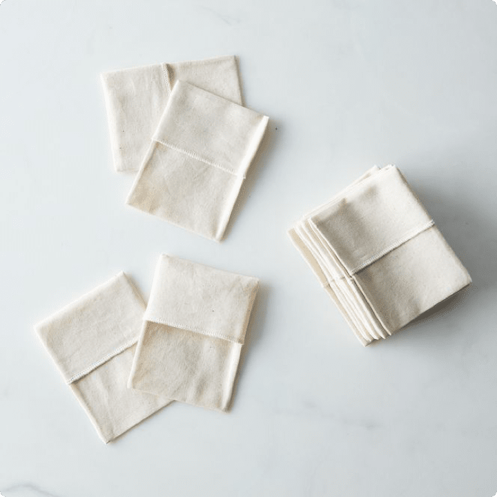
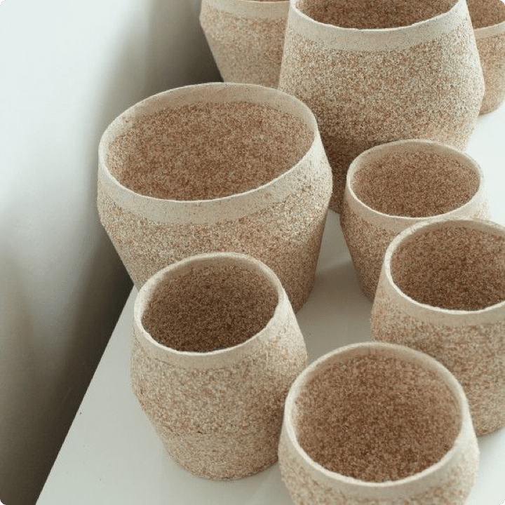
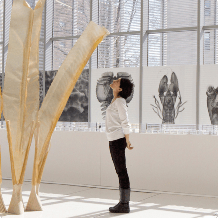
Nature

A narrow color palette with warm natural accents, low contrast, sometimes rawness and structure.

  • www.food52.com

    www.food52.com

  • www.shiwarashtian.com

    www.shiwarashtian.com

  • www.dumolab.com

    www.dumolab.com

Ideation

From concepts that were unrealistic to produce to today’s prototype

We already had a prototype developed during the research program that we conducted for constructing our antenna. What can we say, it wasn’t a piece of art. But at least we knew why we were doing all this! We also had a list of features that we wanted to include in our final product.

One of the most important things to be addressed in the design was the E Ink screen. This was good news. The E Ink screen feels very easy on the eyes and gives relief from a digital screen. Its gray color also makes it a great match with our ‘stone’ inspiration.

Choosing the best screen option

During our research, we took into consideration different E Ink screen devices. It was quite a pleasure to discover and use some of them. We realized the benefits associated with exchanging the LCD screens with natural-looking E-Ink ones. No blue light emission and considerably less fatigue of the eyes at the end of the day felt really good.

E Ink screen was an obvious choice for us. We love its pleasant, paper-like, natural feel.

E Ink screen was an obvious choice for us. We love its pleasant, paper-like, natural feel.

Finding a perfect keyboard

We had the inspiration and ideas but we needed more practical information. To gather it, we did a lot of intense research into existing feature phones to identify the solutions that would be worth considering. We also tested different keyboards, although we were already quite convinced by the rounded buttons. You’d be surprised how many parameters you have to take into account when designing a keyboard!

We equipped Mudita Pure with physical keys. Check whether you can still write a message without looking!

We equipped Mudita Pure with physical keys. Check whether you can still write a message without looking!

Having all of this information, we started to imagine, what the shape of Mudita Pure would be like. Now the fun part could finally begin!

Workshop - looking for the perfect shape and fit

Both Gosia and Michal, the founder of Mudita, had their own ideas about the shape. To have them materialized in order to see and test, they met for a session of moulding clay prototypes. Apart from being fun, it brought the first conclusions about the desired proportions, hold and feel.

Aren't the clay prototypes just a perfect implementation of our 'stone' inspiration?

Aren't the clay prototypes just a perfect implementation of our 'stone' inspiration?

Sketches

After selecting the best ‘candidates’, we did some sketching. The purpose was to analyze the shapes with different curves and thicknesses. It was also the moment we began to imagine the best keyboard solutions and think about placing the details, such as torch and side buttons.

Step by step, the shape of Mudita Pure was emerging.

Step by step, the shape of Mudita Pure was emerging.

Modelling of 4 chosen shapes

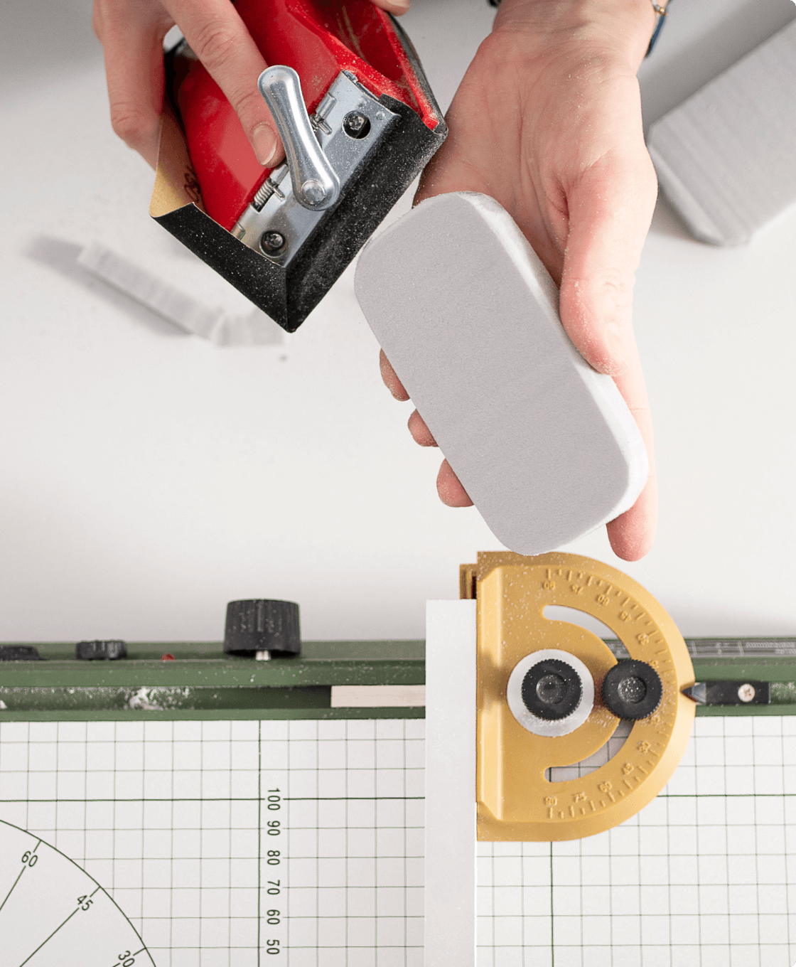
There were 4 winning shapes and we wanted to check how they felt in hand. Using her magic and a thermocutter, Gosia prepared the proposals and gave them some very cute names: Soap, Soap2, Bar, Rounded bathtub.

Designing Mudita Pure wasn't easy. The selected shape has been evolving for many months.

Designing Mudita Pure wasn't easy. The selected shape has been evolving for many months.

The models served us for choosing the best solution when it came to ergonomics and look.

Prototyping decisions

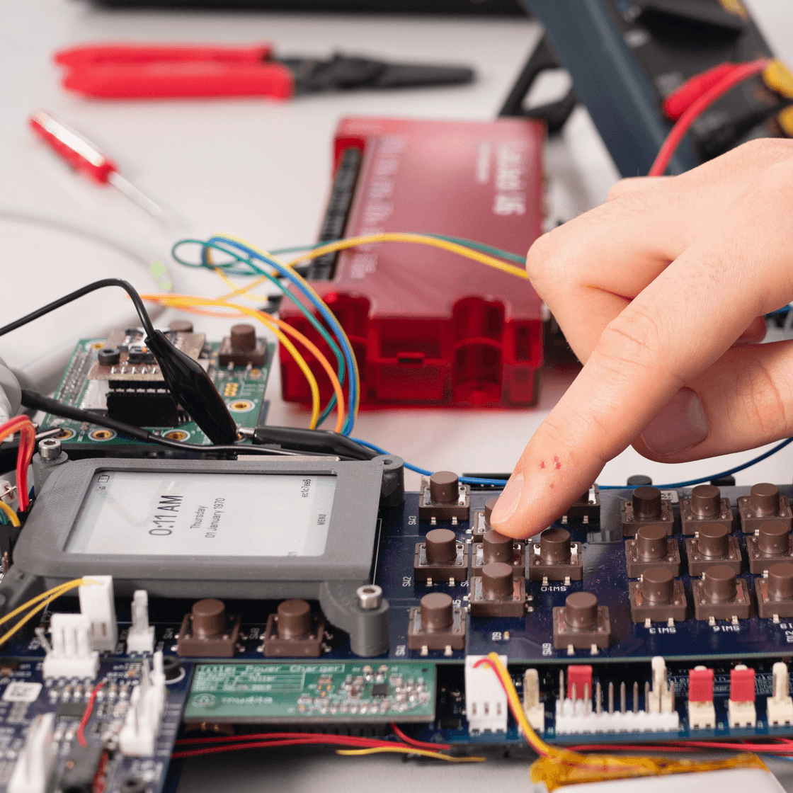
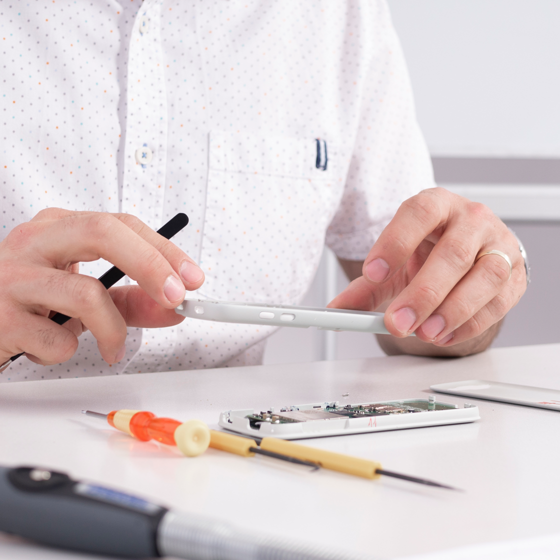
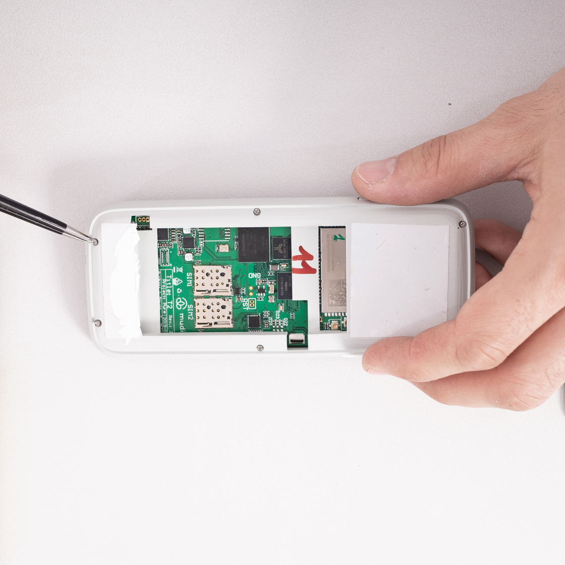
With time, prototypes started to look more and more realistic. We were gradually trying to put all of the internal mechanical parts together. This was the stage where we faced almost all of the constraints on our way.

We didn't want to compromise on the design, nor on the components. It demanded a constant dialogue between different teams.

We didn't want to compromise on the design, nor on the components. It demanded a constant dialogue between different teams.

Every component “wanted” more and more space. It was literally a fight! The solid casing had to be changed several times to fit everything properly.

E Ink

The screen and it’s frontlight turned out to be problematic to fit - requiring a special space between screen and keyboard.

Antenna

This is also quite special - it needs more space in the thickness to work properly

Keyboard

How could we fit all of the buttons whilst keeping the right ergonomics that wouldn’t interfere with the internal parts and without making the phone bigger and bigger? There were several versions of these arrangements and sizes.

Battery

How could we plan all of the internal components to save place for the battery? We had to order a custom-made one as nothing on the market didn’t meet our requirements.

Material

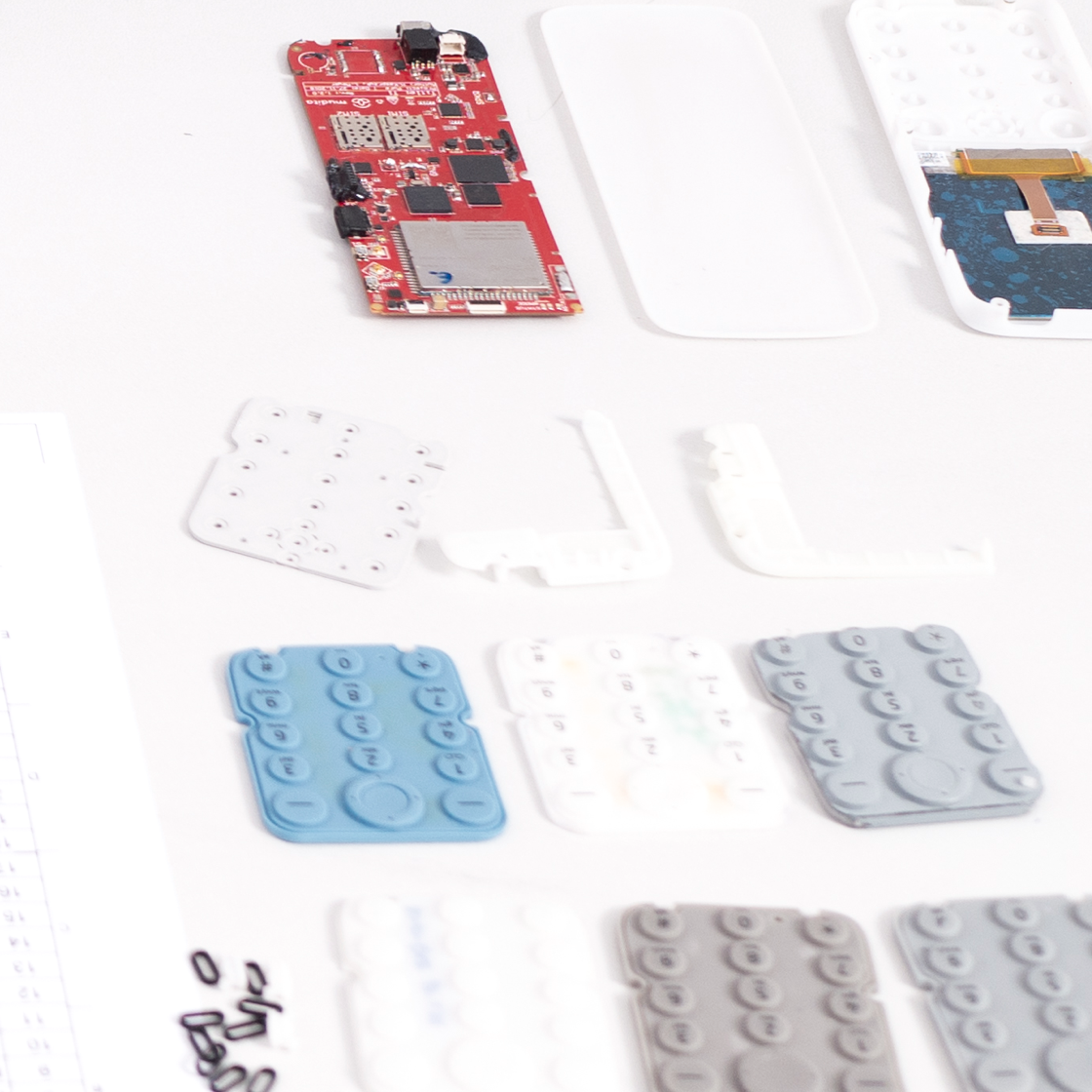
How to make the buttons work smoothly? We ordered dozens of elastomer keyboard prototypes of different hardness, changing the mechanics and buttons inside. We also tested some still plastic solutions trying to achieve a unibody effect.

These are just a few examples of all the battles and compromises between our electronics and design teams. Don’t worry, they are still friends! First, because they are amazing people, and second, because we all share the same goal: to create unique devices of cutting-edge quality and design!

Reaching the finish line

Final design

We believe that our final design fully encompasses our brand philosophy. The best way to begin cultivating Mudita is to simply set yourself the challenge of intentionally trying to share the happiness of others. If you would like to learn more about our design processes, take a look at the Mudita Blog to stay up to date with the latest news.

Sign up for the Mudita Newsletter and receive 5% off your first order.

If you'd like to receive the best stories from our blog, keep up to date with our progress, and get notified about our product releases and special discounts.

By providing your name and e-mail, you agree to receive marketing content and commercial offers from Mudita Sp. z o.o. with its registered office in Warsaw. Your personal data will be processed according to provisions of Privacy Policy at the same time you accept the Terms & Conditions of Newsletter.