5 Reasons Why Minimalism is the Visual Treat Your Eyes Crave
Minimalism has become increasingly popular in recent years, both in design and lifestyle. From sleek and modern interiors to a simpler and more intentional way of life, the minimalist aesthetic has a lot to offer. However, why is it so visually appealing?
Although less is more may sound like a cliché, when it comes to minimalist aesthetic and design, it is the core and essence of the minimalistic example.
In a previous article on our blog, we discussed minimalism as having the power to bring about a sense of freedom and clarity in our lives. This sense of simplicity and clarity is reflected in minimalist design, which emphasizes clean lines, neutral colors, and a lack of ornamentation. The resulting aesthetic is calming, elegant, and timeless, appealing to our innate sense of order and balance.
READ: Reflections on Minimalism: Expectations vs. Reality
Now, let’s dive into the five key reasons why the minimalist aesthetic is the ultimate visual treat for your eyes.
Whether you're a fan of the clean and uncluttered look or simply appreciate the calming and sophisticated feel of a minimalist environment, this article is for you. Get ready to discover why minimalism is the visual delight your eyes have been craving!
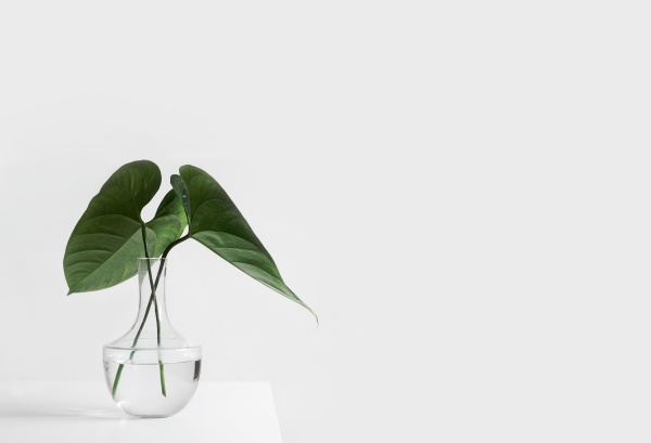
Clarity and Simplicity: Minimalism presents a clean and uncluttered look, making it easy for the eye to focus on a few key elements. The simplicity of a minimalist environment creates a harmonious and calming visual experience, free from distractions. Minimalist design allows the viewer to appreciate the beauty in the simplicity, focusing on the essentials and creating a sense of balance and tranquility.
Emphasis on Essentials: By removing excess and focusing on only the essential elements, minimalism draws attention to what truly matters, creating a strong visual impact. The focus on essentials allows the viewer to appreciate the beauty of each element, without the distractions of clutter or excess. This creates a visually stunning environment that is both calming and sophisticated. Mudita Bell and Mudita Harmony are intentionally designed as simple, single-purpose devices with a functional and minimalist approach.
Mudita design ethos is centered around a modern, minimalist approach.
Use of Negative Space: Minimalism often makes use of negative space, or the empty areas around and between objects, to create a sense of balance and tranquility. This allows the viewer's eye to rest and creates a visually calming environment. The use of negative space has the desired effect of making a minimalist environment feel spacious, even in small spaces.
Neutral Color Palette: Minimalism often employs a neutral color palette, which creates a harmonious and calming visual experience. Neutral colors serve as a neutral backdrop for accent pieces, allowing the viewer to focus on the essentials and creating a sense of balance and tranquility. The use of a neutral color palette creates a sophisticated and timeless look, making a minimalist environment visually appealing for years to come.
Modern and Sophisticated: Minimalism is often associated with modern and sophisticated design, making it appealing to many people who value simplicity, functionality, and clean lines. The focus on essentials and the use of a neutral color palette creates a visually stunning and modern environment. Minimalism is not just about removing clutter, it's about creating a sophisticated and visually appealing environment that showcases the essentials in a beautiful and simple way.
As you can see, the minimalist aesthetic has a lot to offer in terms of visual appeal. From clarity and simplicity to the emphasis on essentials, the use of negative space, a neutral color palette, and a modern and sophisticated look, minimalism creates a visually stunning and calming environment.
The modern and sophisticated design philosophy of minimalism also resonates with Mudita's ethos, as we value simplicity, functionality, and clean lines.
Whether you're a fan of the minimalist look or simply appreciate a visually stunning and uncluttered space, incorporating minimalist principles into your design can have a positive impact on your visual experience. If you're ready to bring some minimalism into your life and enjoy the ultimate visual treat for your eyes, consider incorporating these key principles into your design.
If you’d like to read more about topics connected to this subject, please check out some of our other articles:
To learn more about Mudita, we invite you to explore our blog and join our expanding Mudita Community on our FORUM.
Related stories

Better Sleep Starts with Good Sleep Habits
Better sleep starts with good sleep habits. Discover why sleep is important and how small, consistent routines improve sleep quality and well-being.

The Story of Radiant Automatic & Designing Time Differently
Read about the story behind Radiant Automatic, a Swiss automatic field watch designed with durability, and mindful craftsmanship. Wear time differently.

Introducing Mudita Mindful Design
Mudita Mindful Design is our in-house framework for building clear, intentional E Ink interfaces. Learn our design principles for calm and mindful technology.
If you'd like to receive the best stories from our blog, keep up to date with our progress and get notified about our product releases and special discounts.